
155: Colours of the Year.
A heads up...This post contains affiliate links - which means I may make commission at no additional cost to you. But I only recommend products that I love so if you choose to support my business in this way, then thank you.
This week, I played a game of Would You Rather with my Instagram followers.
And man, you lot love to give me your opinion. It was great, I really enjoyed hearing your ideas and insights.
So if you’re not following my socials (er, why aren’t you?) then you’ll wonder what it was I asked.
Well, despite it being March already, I figured we were still early enough in the year to discuss the colours of the year, decided upon by those in the know.
Now obviously, we had to include this year’s entry from colour giant Pantone, but also Dulux and Graham & Brown had offered their choices too. And what lovely choices they were, all three; rich, earthy and robust.
Interestingly, as a colour palette, they all work beautifully together and really lean into this season’s preference for muted earth browns and neutrals. But opinion was divided on the polls, with Pantone’s Viva Magenta coming out as a clear favourite. Perhaps the brightness and obvious richness of the colour is more appealing than those tonal browns, which I’ll admit might take a bit more getting used to, as interiors move solidly away from the grey invasion of a few years ago.
Most of the comments also seemed to consider all three as paint colours only - but if like me, you’re more into your cream and white neutrals - I’d only ever use any of these colours as accents.
But let’s consider these colours now in their own right, how could you use them?
I’ll show you.
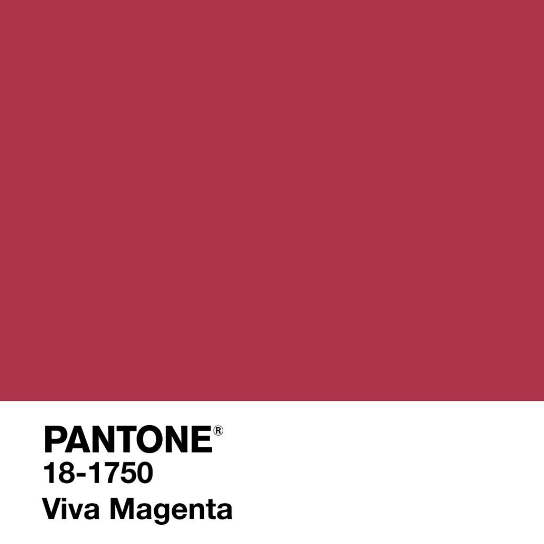
Viva Magenta

Described by Pantone as an “animated red which vibrates with vim and vigour”. Fair enough.
It’s definitely more red than I would usually describe magenta but hovering around a berry red shade, gives a it a classier edge than I would expect.
This shade is dying to be a maximalist, and I’m not sure it would have the right amount of impact if you restrained it to a single feature wall. My suggestion is to balance it amongst complimentary colours and tonal shades. This is all about building colour on colour and creating interest through rich textures, luxury velvets and eye catching patterns. Go big, and stay home.

Paint it: Annie Sloane wall paint. Capri Pink 2.5l
£56.00/Homebase.

Picture it: Viva Magenta Print, Color of the Year 2023, print at home, Digital Download
£3.78/ The Mercury Gallery, Etsy

Pattern it: Pink Floral Upholstery Fabric
£13.99 per metre/ My Lush Fabric, Etsy
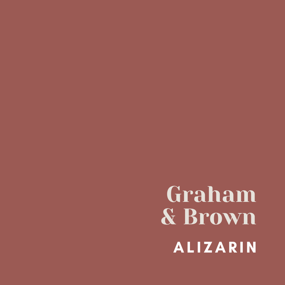
Alizarin
“A deep and moody, yet refreshingly warm Auburn red”. That’s how Graham & Brown describe Alizarin, their colour of the year.

I have to agree. I love the drama this shade brings without feeling overwhelming. This is one for sultry, romantic bedrooms (paint all the walls, be brave) and is easily accessorised with warm gold accents.
Deepen the shade with a darker colour, somewhere between a navy and an anthracite, or balance the warmth this shade exudes with a lighter neutral shade.
However you style this one, it’s a beautiful colour that you can’t really go wrong with.

Paint it: Graham & Brown, Alizarin 2.5l
£48.00/Graham & Brown

Pattern it: PARADYS ALIZARIN WALLPAPER
£80.00/ Graham & Brown

Plump it: Circular Knit Abstract Cushion
£10.00/Dunelm Mill
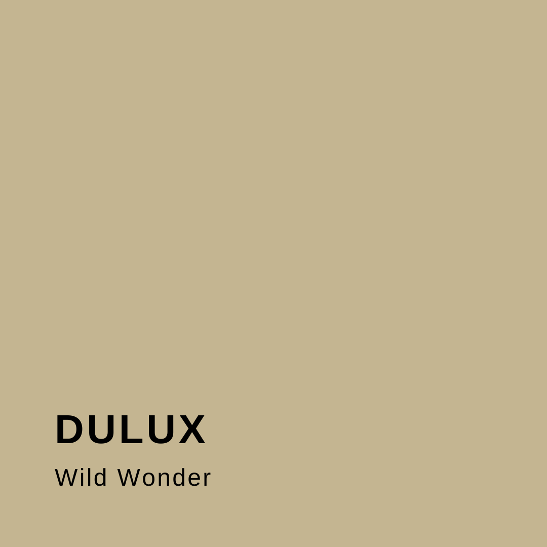
Wild Wonder
Wild Wonder is Dulux’s offering, a colour to “connect with nature and help you feel better in your home”. Now who wouldn’t want that?

A warm neutral, that grounds you. Soft and romantic this colour can be used all over the house but would work best in a brighter, south facing room. Pair it with rich greens to really emphasise that connection with nature.
If you don’t like it as a paint colour, it’s a gorgeous shade to bring into your soft furnishings and window treatments.
For a bigger statement, choose fabric shades of this for sofas and headboards that tone in and warm up your colour palette. It might be the safest colour of the three, but it’s definitely the most versatile.
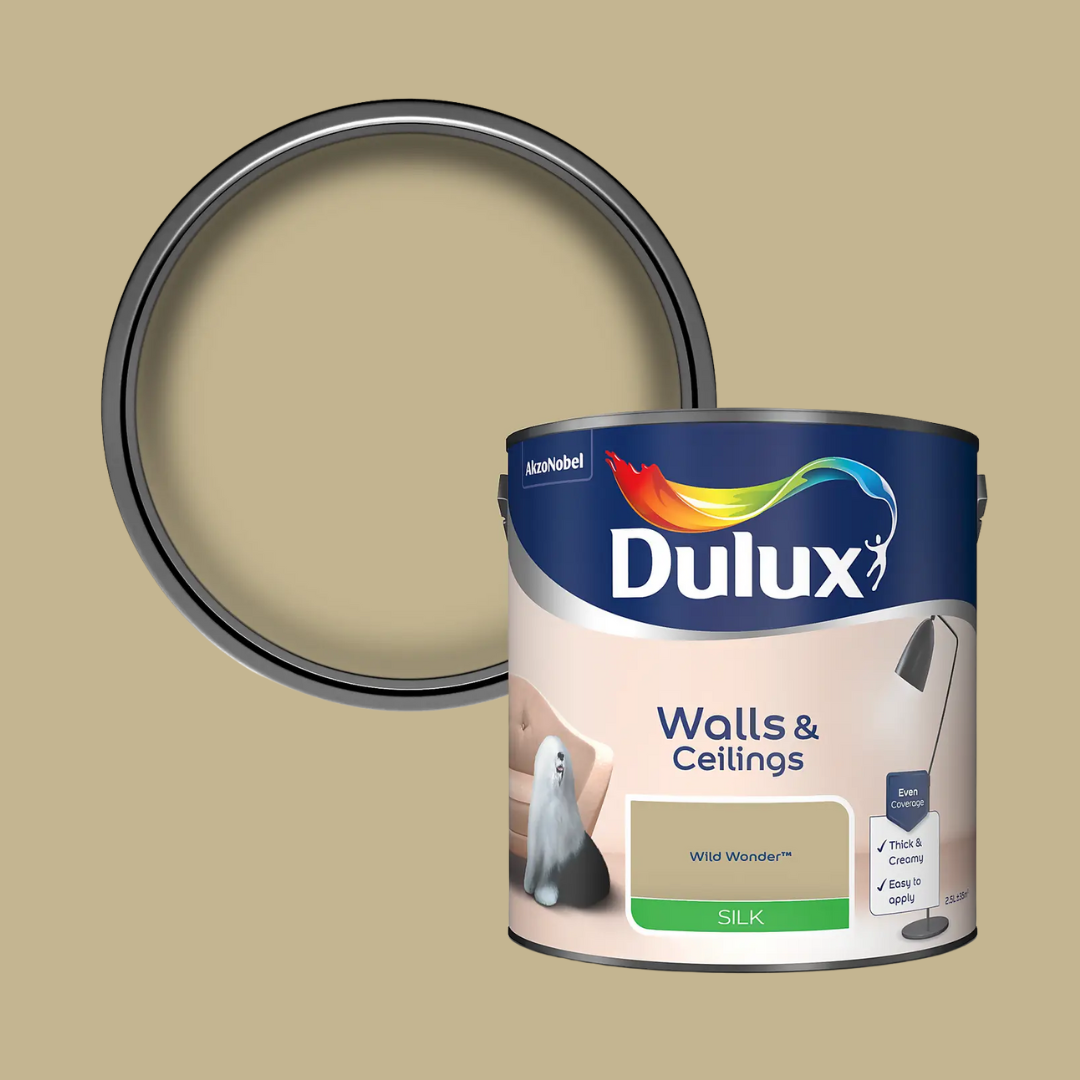
Paint it: Dulux Walls & Ceilings Silk Paint Wild Wonder - 2.5L
£21.00/ Homebase

Sleep in it: M&S X Fired Earth Washed Cotton Duvet Cover
From £35.00/ Marks & Spencer

So there’s my round up. Which colour would you rather have in your home?
And if you’re asking me?
It’s a tough choice, but Alizarin wins this one.